Retail Analytics Platform
No matter what industry you are in, be it retail, exhibitions, entertainment or sports - CountBOX can help you analyze your retail space and visualize consumer demographic data to make smarter data-driven decisions.
Powerful Dashboards
Customize dashboards to share the system across your organization. Build separate reports for marketing, merchandising, store management, and corporate teams. Expand the way data is used across the business.
Scalable to Any Number of Locations
Our software can track any number of locations across the world. Use CountBOX retail analytics platform to accurately compare performance of stores across multiple locations. Monitor conversion rate and optimize store operations.
Do More With Your Data
Need to track a custom KPI? CountBOX offers ways to measure business-specific metrics in order to help your team members improve store profitability and find new ways to decrease costs. We provide API access to feed data in or out of the system to connect to multiple retail analytics sources.
Retail Analytics Platform #1 CountBOX DELUXE
CountBOX makes it simple to access data and analytics about your store, chain of stores, shopping mall or other locations through the cloud. Real-time data, updated every 15 minutes, with an accuracy rate of 98%.
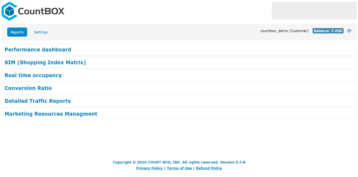
From CountBOX's cloud dashboard, you can:
• access a full selection of reports
• customize which reports are shared with which departments
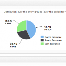
• access data about foot traffic in different areas in your business or passing by the front door
• access data about conversion ratios and marketing
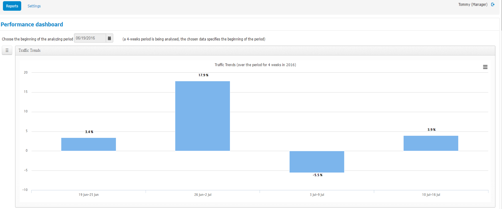
The “Performance Dashboard” gives you graphs, tables and charts comparing footfall traffic over a 4-week period of your choice.
You can:
• View 9 different graph options
• Monitor different areas of your business
• Analyze data by the day or by the week


This is the same data from the previous slide expressed as a table.
Below, the same data is expressed as another bar graph, this time broken down by day of the week.
It allows store owners to view a comparison of all four Sundays, all four Mondays and so on.
This graph breaks down shopper traffic by the hour, averaged over the four-week period.
Customize which of your stores appear on the graph.
Analyze and compare specific days, isolating one or two at a time, or however many you want!


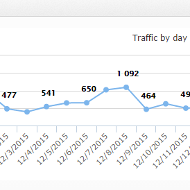
This line-graph depicts actual shopper traffic by day over a 4-week period.
Note: the store had low traffic on the 4th of July.
With the CountBOX dashboard, you can:
• choose which dates to analyze
• choose which location or locations
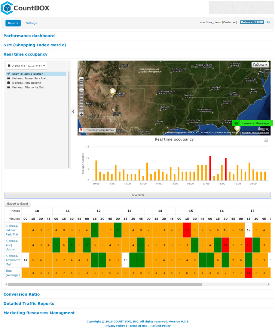
• see how many people are inside your business, updated every 15-minutes
• export the data to Excel
• translate the data into graphs in a variety of formats
• share these reports selectively with your departments and personnel

This bar graph shows the total shopper traffic per week over a four-week period. The exact number appears at the top of each bar.
CountBOX will work with your POS provider to integrate your API with our dashboard.
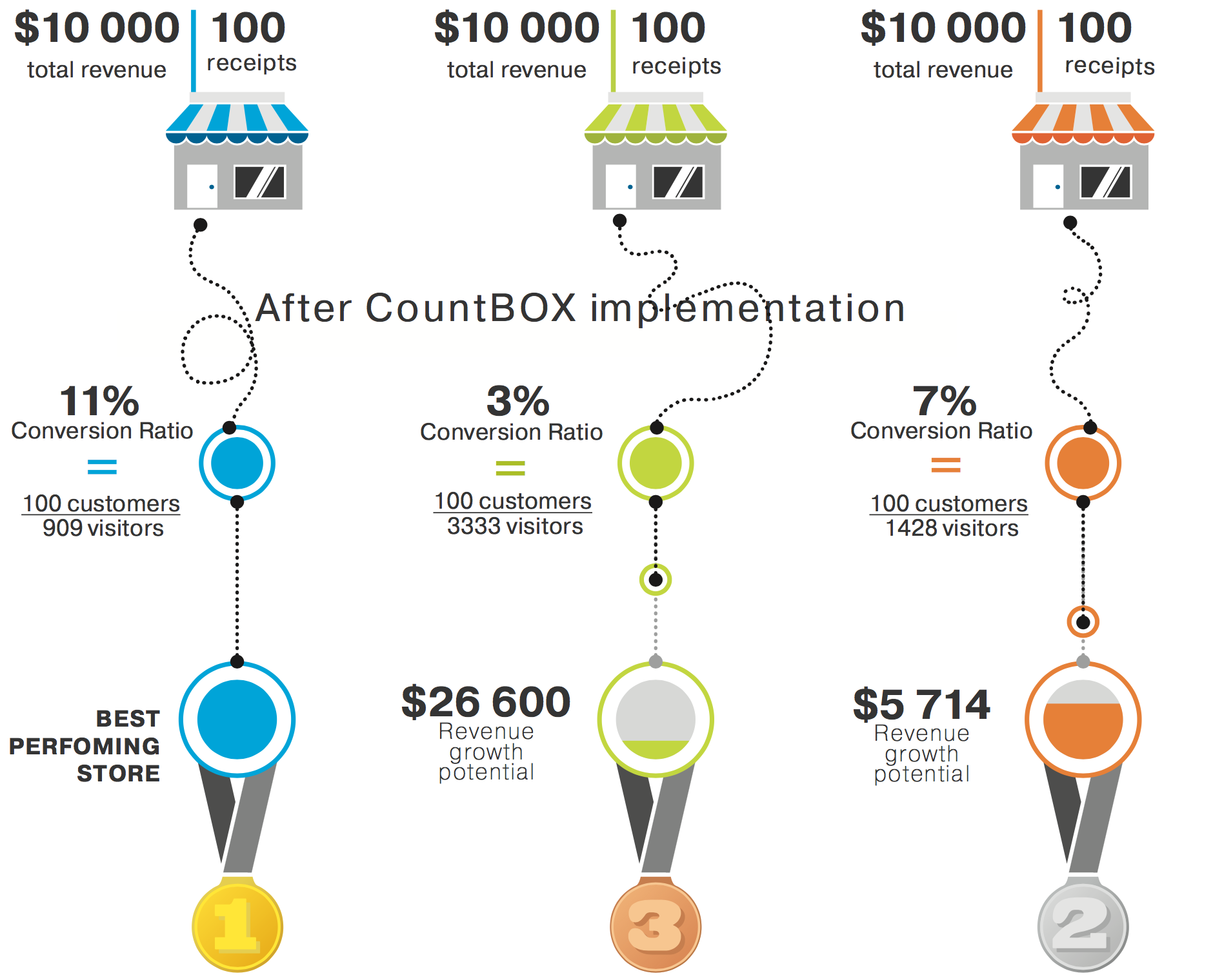
All we need is your revenue and transaction records to calculate conversion ratio by day, week, month or year.
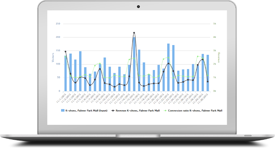
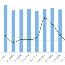
This graph shows visitors, conversion rates, transactions and revenue. From here, you can:
• Click to show data for only one location or only some of the analytics
• Break down data by a business hour
• Change the range of dates
• View the data as a table
• See which of your locations are performing well and which ones need attention
• React quickly, improve performance and increase revenue.


This is the data from the “Conversion Rate” graph on the previous slide.
Select “Revenue” on the graph if you want to see revenue data in this table.
Select “Business Hours” and the table will show the data broken down by the hour.
Otherwise, the table will show you the total data for each day.
You can directly export this table to Excel by clicking “Export to Excel.”
“Detailed Traffic Reports” gives you a more in-depth look at shopper traffic.
This graph shows traffic by hour. You can customize the range of dates, location(s), whether you see your data by the hour, day or month. Select “business hours” for data only during the hours when your business is open.


You can select entries (incoming traffic) and/or exits (outgoing traffic).
You can view this data as a graph or as a table and export it to Excel.
This graph displays entries (incoming traffic) and exits (outgoing traffic) for a month.
The count is low on the last day because the graph was generated part-way through that day!


This table shows the data from the previous graph.
With CountBOX, you can analyze foot traffic by the day or by the hour for each of your locations.
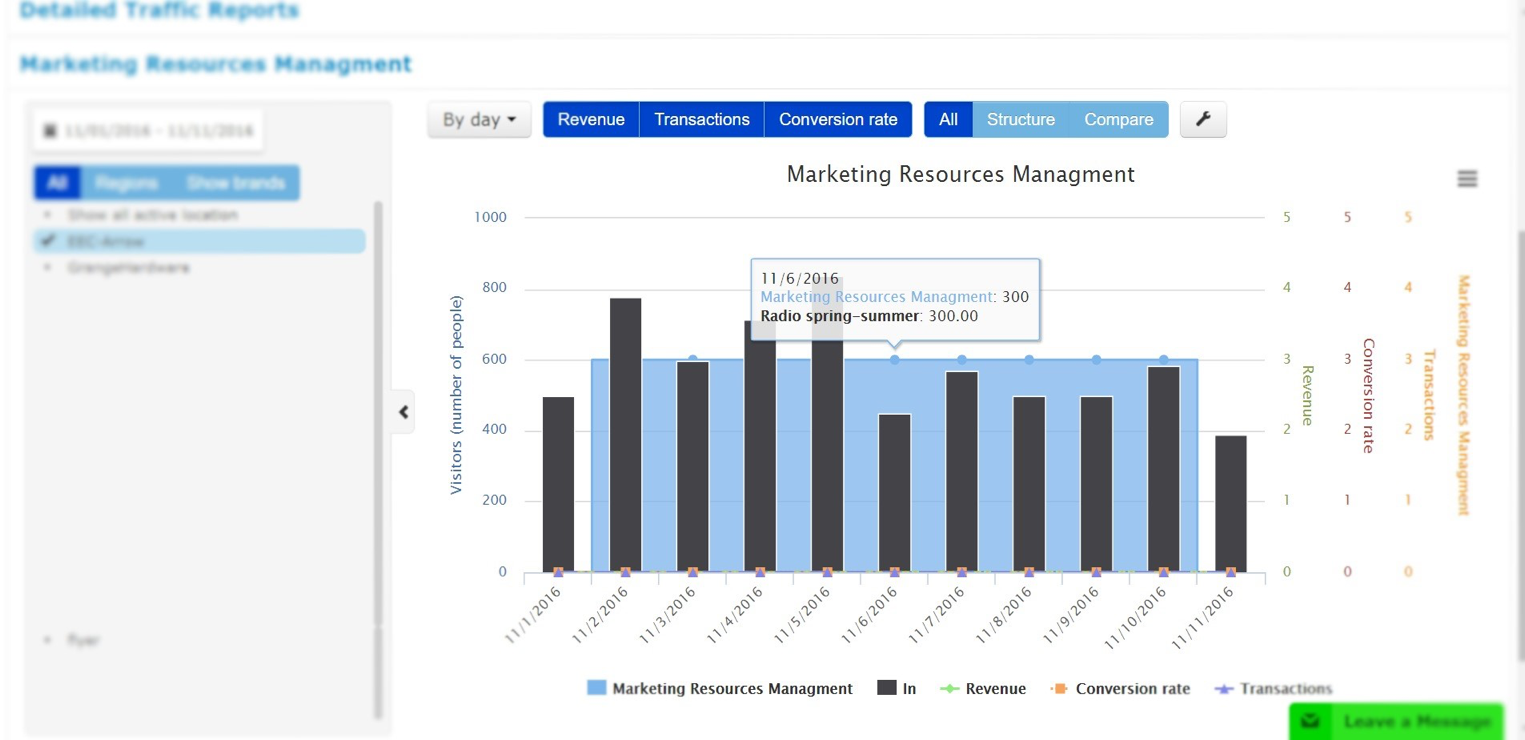
CountBOX helps you run marketing campaigns. Enter the dates, locations and budget of your campaign, then watch how the stores and dates you are targeting perform compared to your other times and locations. It's the best way to measure how effective your marketing is.
This is a real-world version of online AB testing.
Powerful Retail Analytics Platform CountBOX DigitalHub
Hold on, please. We still work hard on it. We are going to launch it soon.

